LADAVEEDA curated Beauty & Skin Care
Brand story
Concept and brief
LADAVEEDA, the curated beauty and skincare from Thailand. They established the online cosmetic shop to serve the cool stuff and outstanding authentic brand from the US.
According the word ‘LADA’ comes from the Baltic and Slavic mythology associated with beauty and fertility. When they tell me about the concept of their brand. It makes me so thrill to create this Branding.
Here they are…
LOGO set
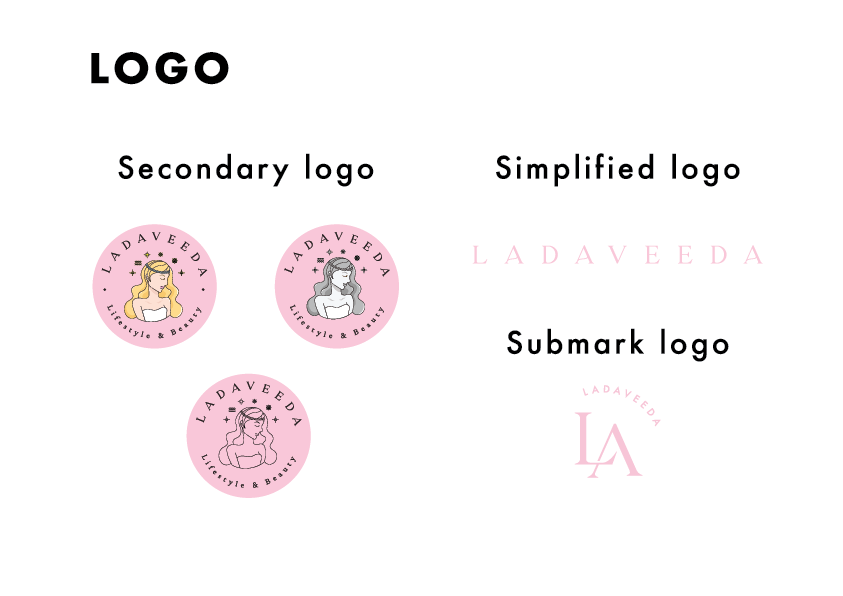
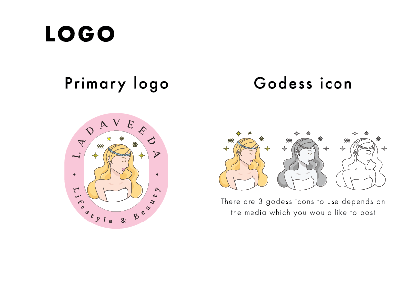
I created 3 variations of Goddess icons. There are fulled-color icon, greyscale icon and line art icon for the brand to use in different media. I also created the different logo types.
- primary logo
- secondary logo
- Simplified logo
- Submark logo
Primary logo
use in profile photos or the media, prints where they want to tell mood of the brand. it is a fulled-color with illustration goddess so the customer obviously see and feel of the brand.
Secondary logo
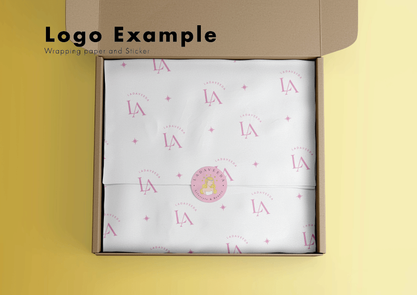
You can feel the same feeling of this logo but in different form in circle shape. This logo can still represent the brand with less detail. Use as a brand postage sticker.
Simplified logo
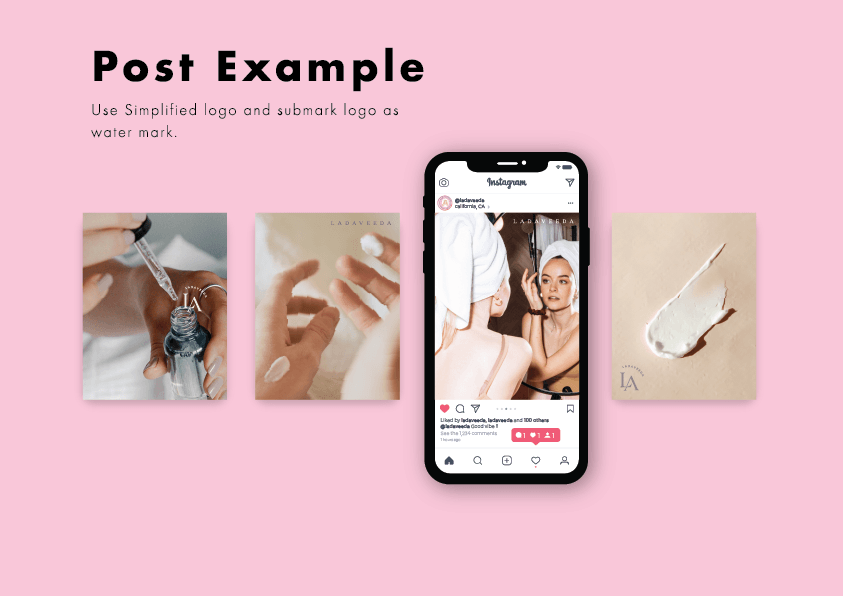
The reducing detail logo, only typeface. basically use as watermark.
Submark logo
The abbreviation of ‘LADAVEEDA’ logo. Use as watermark or repeated pattern.
Color palette
- Primary color
- Secondary
- Shade and Tint
Primary color
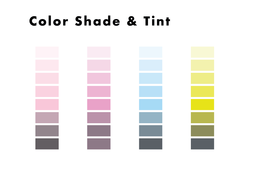
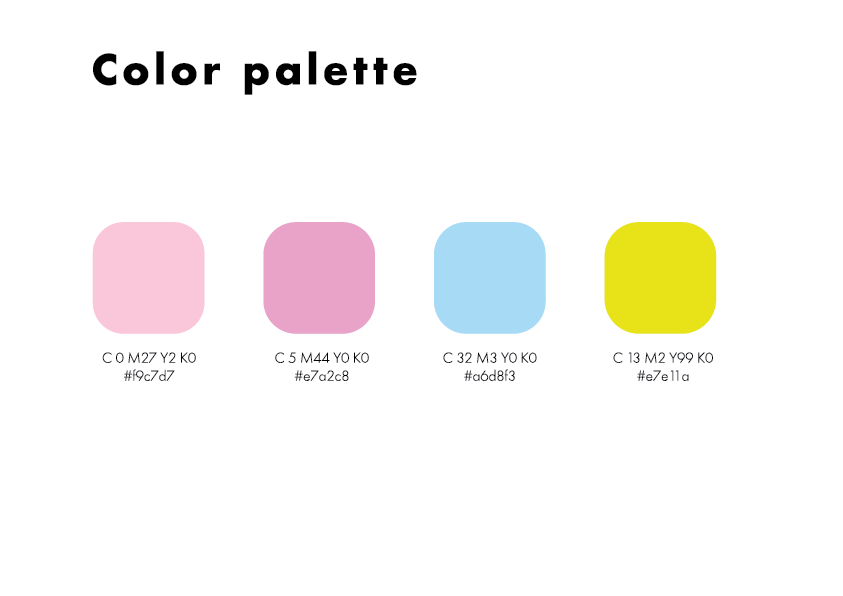
The main color of the brand is baby pink and the rest are the colors which help the brand look more feminine. 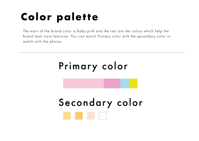
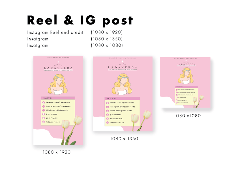
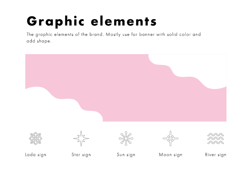
Graphic elements
LOGO Example
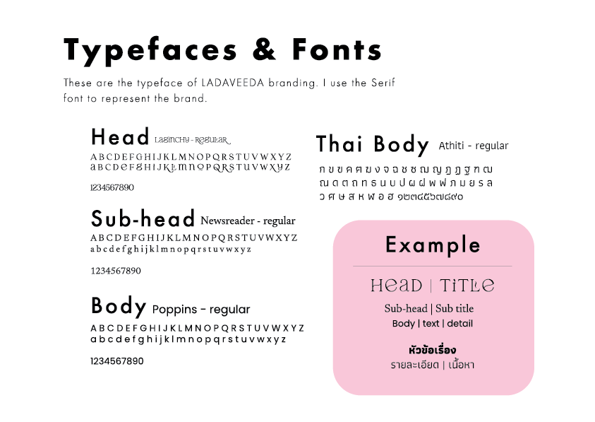
Type faces
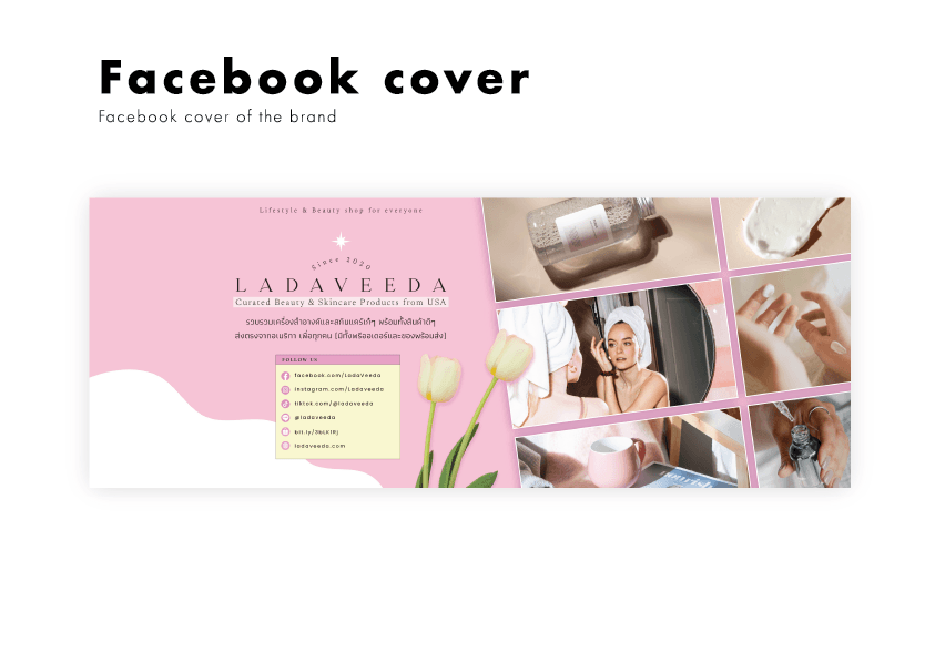
Post Example
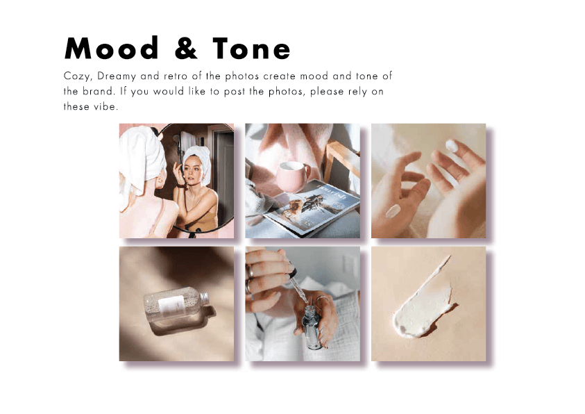
Mood and Tone
Read blog 👇
How I design this logo


